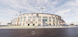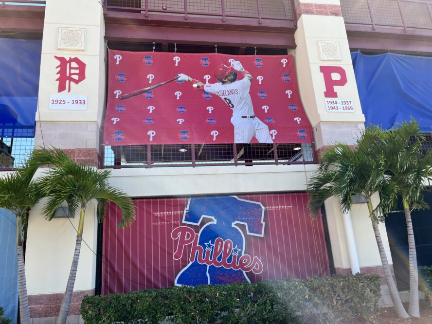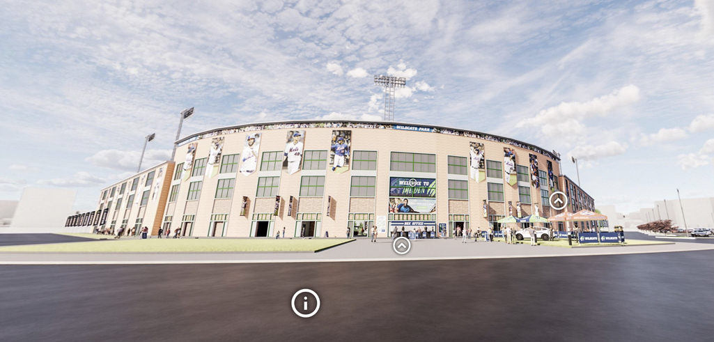
Make the most of your ballpark with our Virtual Baseball Signage Walkthrough. Built on nearly two decades of baseball signage experience, the Virtual Baseball Signage Walkthrough is an interactive resource designed to take you on an in-depth tour of an entire baseball stadium while calling out signage opportunities and showing examples along the way.
HONESTY | INTEGRITY | SERVICE
MENUMENU
- Work
-
-
-
-
-
-
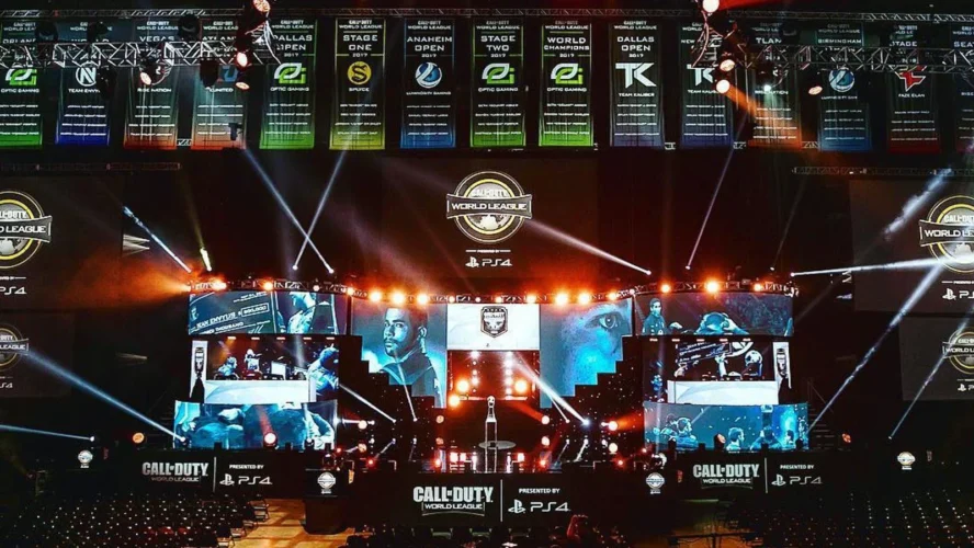
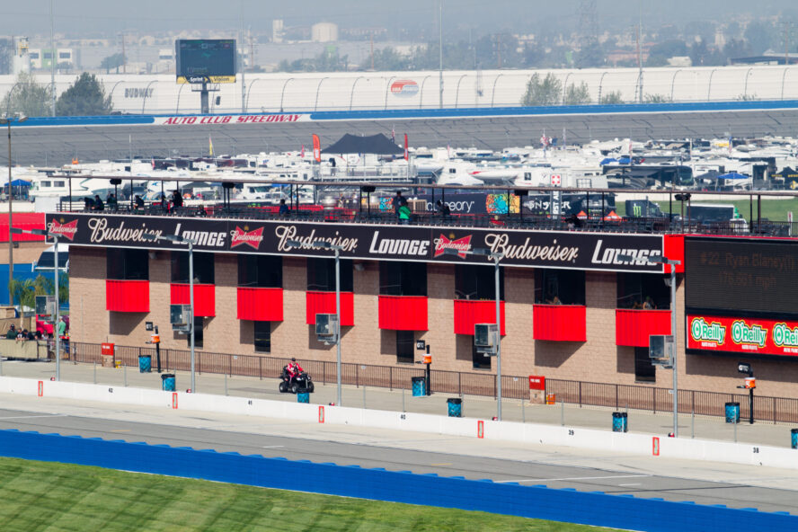
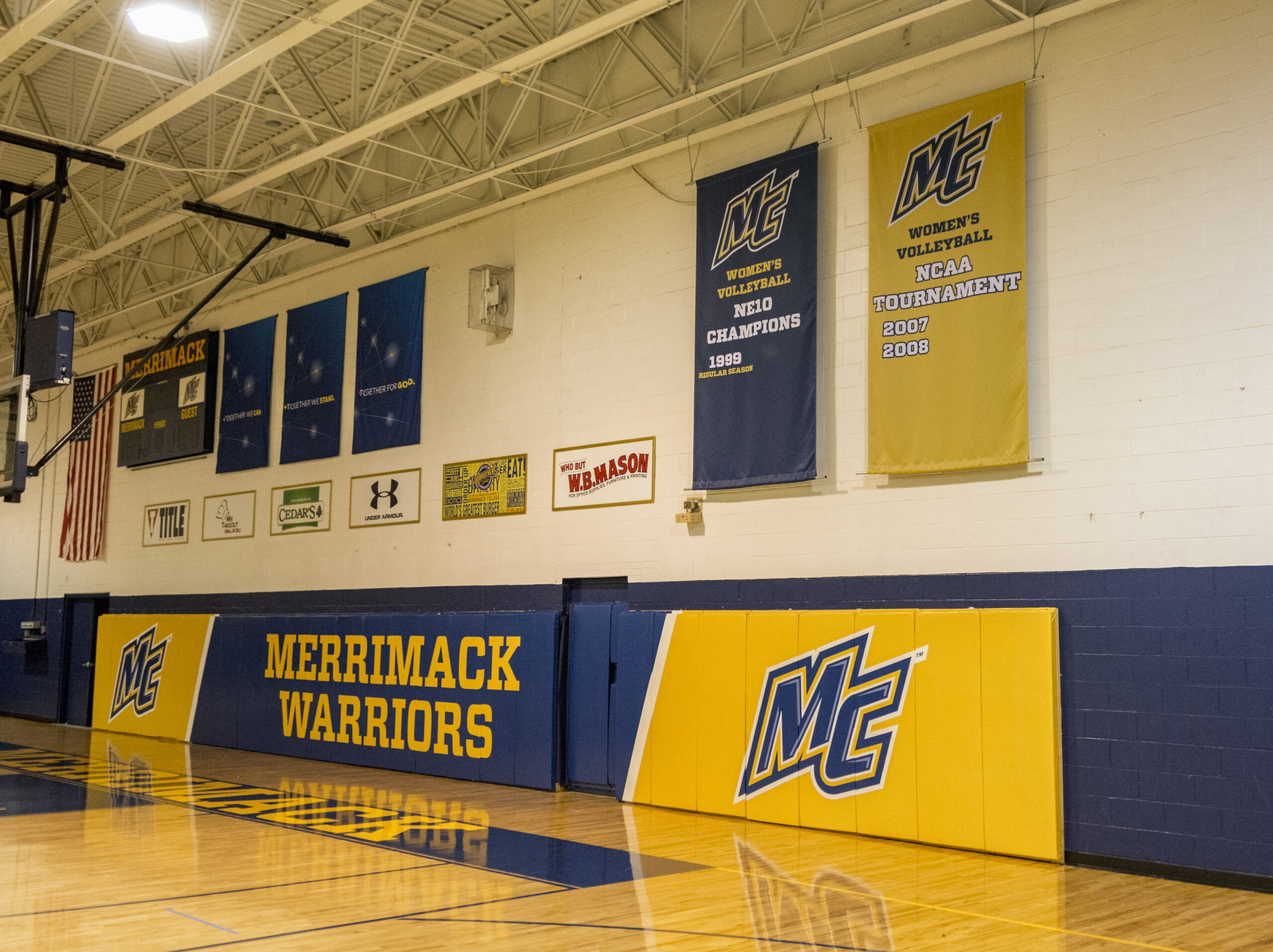
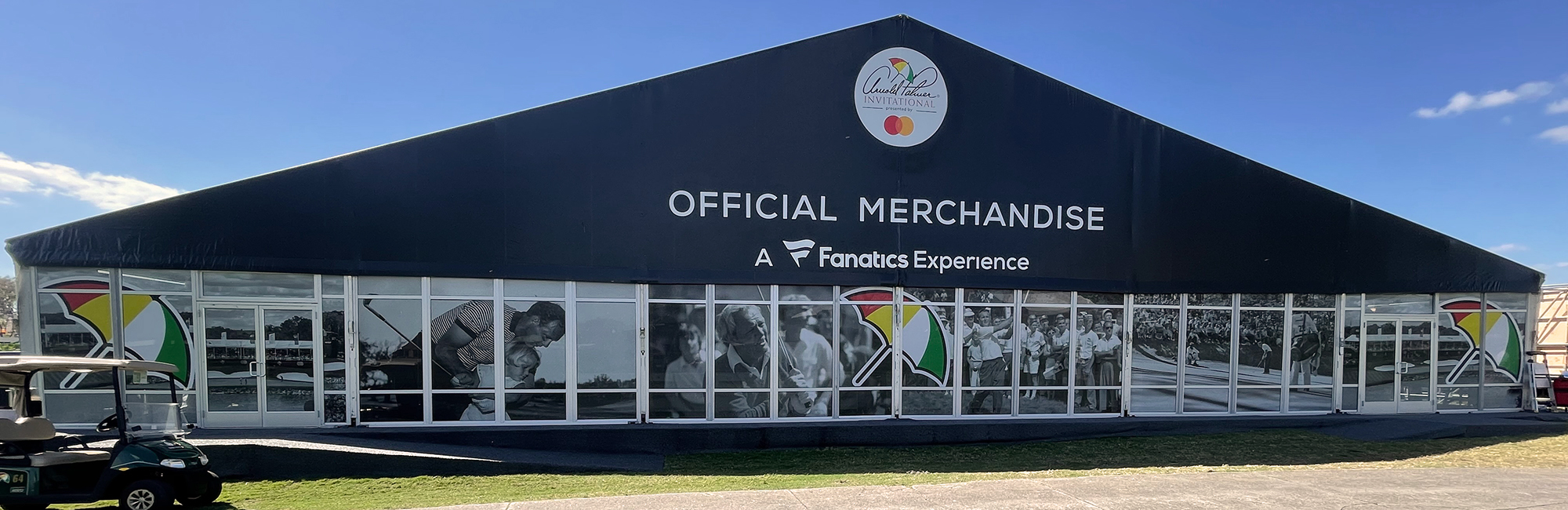
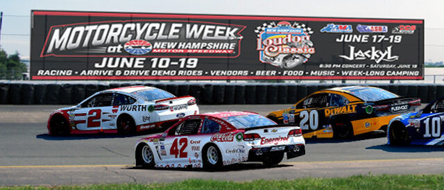
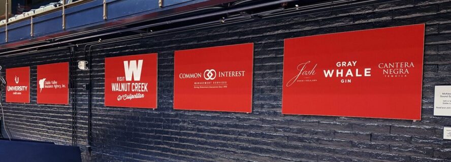
Welcome to the Project Highlights section of AMI Graphics, where creativity meets craftsmanship and every design tells a story. Here, we showcase the culmination of our dedication to excellence, bringing brands to life with precision and flair.
-
-
- Products
-
- Services
-
-
-
-
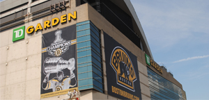
As signage experts, AMI Graphics understands that each custom signage project has many facets to take into consideration ranging from size and material to when and where it will be installed.
-
-
- ABOUT
-
-
-
-
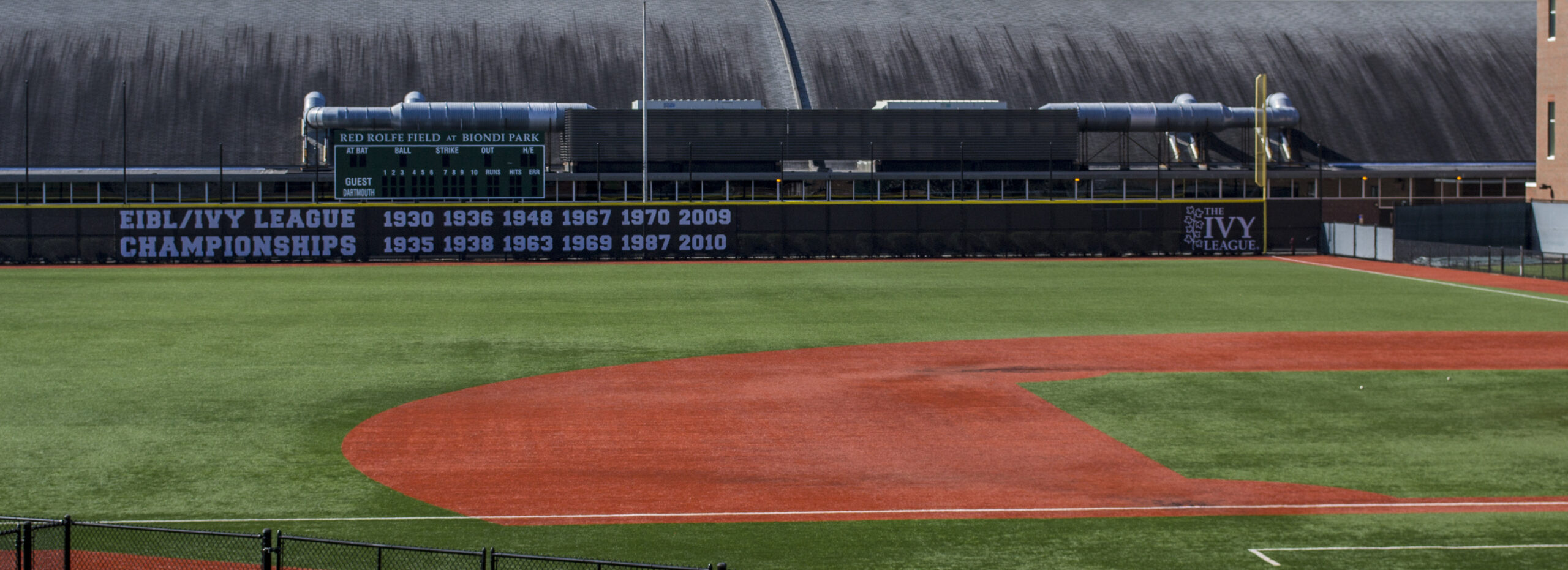
Visualization is a vital part of planning. With the ability to see all or parts of what you are planning, it is easier to make decisions and adjust plans as needed. While this can be said for any type of planning, it is especially important in projects with a physically visual component – such as baseball stadium signage. The majority of stadiums have the same components but in different layouts….
-
-