


Risk management signs aren’t just a nice idea – in many cases, they’re the law or required by insurance.
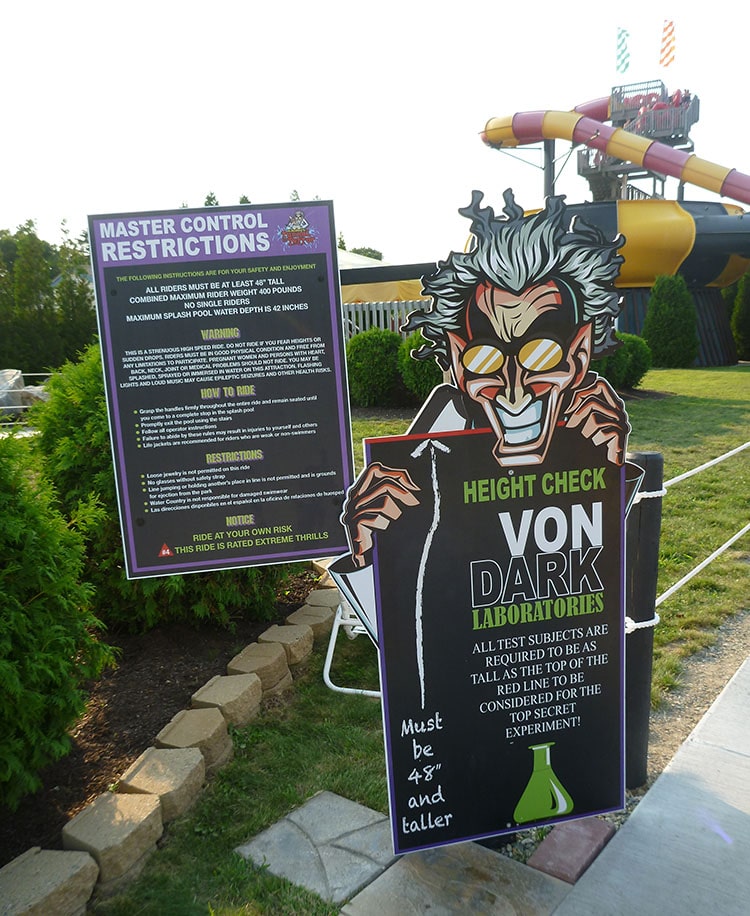
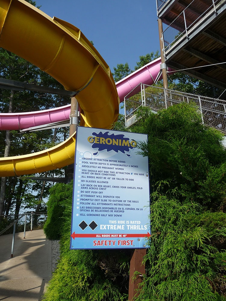
They’re the type of warnings that are often required, or at least strongly encouraged, to alert people to the possibility of injury to themselves or their property. Think amusement park signs that tell little kids they have to be taller to board a ride, or tell big kids that they can no longer safely fit on the little rides. Or tell all groups to always keep their arms inside the tram.
These signs serve several purposes: they can be a head’s up to visitors, staff, or employees about dangers; they can reduce a company’s liability if an injury or damage occurs as a result of disregarding the sign.
Though these warnings should be thought of as serious, the tone doesn’t have to be. Risk management signs can be an extension of a company’s brand, essentially a message on behalf of the company to follow the rules, using whatever voice or persona you use for other communications.

Try these strategies:
- Make them fun. If your audience is families, make the message basic and polite, almost cartoonish. At a hockey game, a bold warning of “beware of flying pucks!” with a drawing of someone getting smacked in the head can be more effective and understandable than a long string of legal terms that little (and some big) readers aren’t going to understand, let alone read all the way through. Same with a swimming pool/aquatic center that can show people slipping and hurting themselves if they run instead of paragraphs about proper poolside conduct and a laundry list of cautions.
- Incorporate your spokesperson/mascot/icon. The above hockey venue can have the puck warning on the sign delivered by the team’s official mascot, rather than a generic safety message. Hockey fans can identify this person/animal as the face/voice of your organization, and recognize him/her/it as an authority.
- Words and symbols. One of the takeaways from OSHA’s push in the 1990s to update safety signage was to make sure a message is understood by everyone, not just English speakers. For instance, a sign warning about the risk of electrocution can have lightning bolts rather than just the words “High Voltage.” OSHA also has suggested that signs should also include possible consequences, not just a vague statement about high voltage somewhere.
- Place signs where they get noticed. Safety pros warn against signs looking too nice, and blending into a room’s décor like wallpaper. This might be OK for office signs like a company’s mission statement, but the purpose of a warning sign is to get people’s attention fast, and not be aesthetically pleasing. This advice comes from Aquatics International, which constantly balances the need for water safety rules with the inability of people to obey, understand, or even see printed rules. It also suggests posting the same rules multiple places just in case some are missed.
- Make them memorable. You don’t have to be graphic about the consequences of not heeding a safety warning, but you can make people chuckle and tell their friends about the funny sign, which further reinforces the message. There are clever ways to word or design your signs to make sure viewers laugh – and obey!


")


")


